

Sound the Trumpets . . . Beat the Drums! Alert your people! The 2016 Pantone Color of the year is, wait, there are two? Hold the presses . . . The 2016 Pantone Colors of the year ARE
(wait for it)
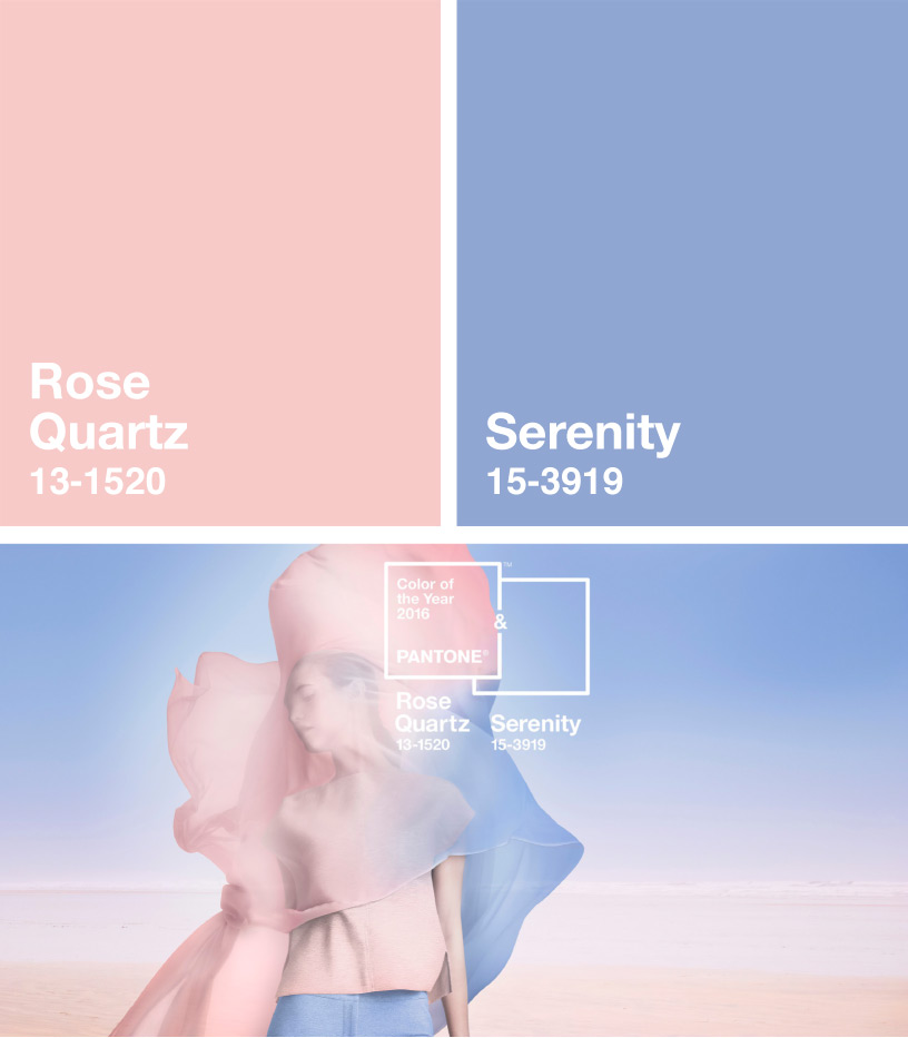
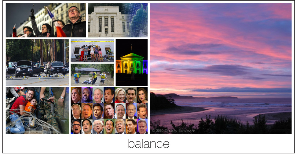
Two colors? That is new. It seems as though in 2016, Pantone will try to persuade designers to use a more calming pallet. Why? There are several obvious reasons if you think about it; the economy is building, we are working longer hours, people are stressed and glued to their devices, there is concern in the air as tragedy after tragedy hits us, and the U.S. has a Presidential election in November which adds to the uncertainty of our country. So, how on a designer level can we alleviate some of this anguish? Pantone suggests wrapping ourselves and our lives in calming, natural colors.
Pastels?!?! At first site, I was a little taken aback. I am just not a fan. They have their place in the world (like the beauty of a robin’s egg which translates sublimely into paint color and design or those luscious pink and purple sunsets that wipe your mind clear (not far off from the 2016 Pantone colors of the year), but I was having a hard time wrapping my head around how these two colors were going to fit into my design world. In reality, I probably won’t be using the actual colors at work. I work with a lot of men and technical professionals, but maybe these two colors will affect my design in another way. What are these colors really trying to get us to do?
Maybe I won’t necessarily be presenting new campaigns to my clients that are light rosy pink and pale purple-blue, but maybe I will take their lead and promote more calming design concepts. Instead of ramping up the stress outlined by the issues we are passionately working on, we find a way to show our audiences how solving the issue will bring serenity. Isn’t that what we all really want anyway?!
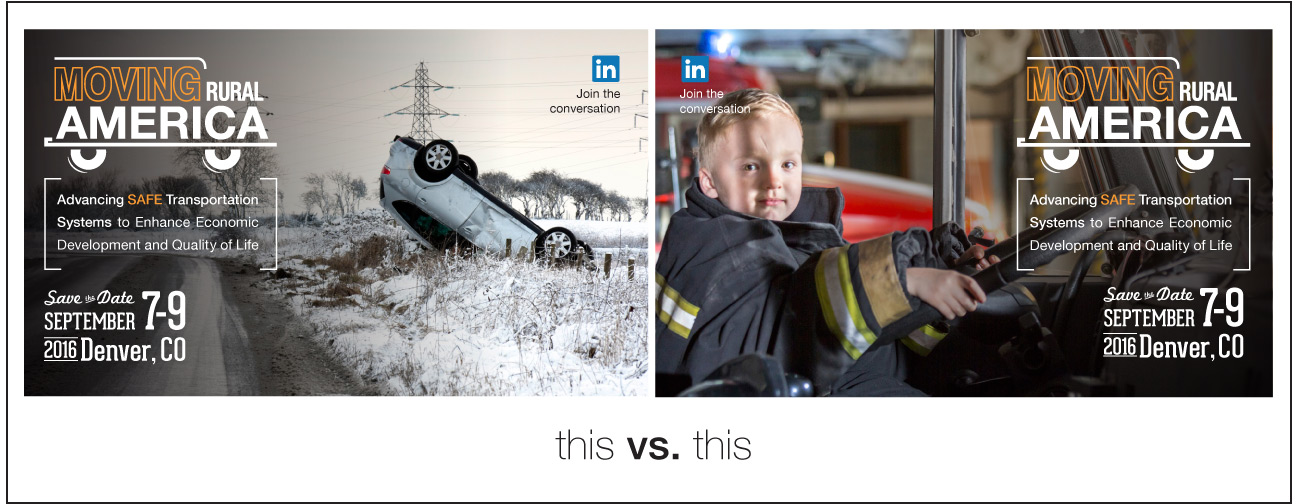
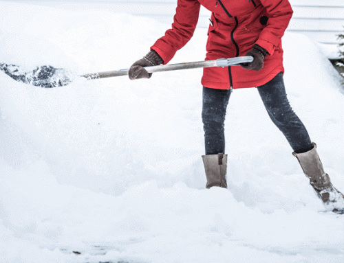
How does this relate to my work right now? It actually coincides fairly well. I am currently working on a Transportation Safety Summit marketing campaign where a similar juxtaposition has come into play – not with color, but with presentation and promotion. The conference board is split down the middle. One side wants stark statistics (A causes B). We show our prospective attendees the tragic crashes on unsafe roads. We show people dying, people like you and me. It is scary and effective. We have all seen these car crashes, heard the news stories of families being ejected from their vehicles, a semi-truck losing control on an icy road. We can relate, but it is scary and in your face. It has been done over and over and over again – because it is successful. The other half of the board wants a very positive campaign? Showing their audience the other side, how it could be, how we could protect and save more lives, and protect our future. Young and old can live and thrive in our communities if we take care of them and ensure they have safe viable transportation systems. These communities will grow and be prosperous because it is in everyone’s best interest.
So how are we working with these two perspectives? We use both.
This is a great analogy of what is happening with the color world. Pantone is attempting to neutralize society with the psychology of color. It is really about the juxtaposition of nature, right? As we all know, nature is beautiful, but it can also be fierce. We need balance to bring neutrality into our life. So as Pantone is calming the world during this time of angst (just walk down the seasonal aisle in Target and you will feel enveloped by ROSE QUARTZ and SERENITY), pulling us back into the soothing side of nature, we can do the same with the stories we portray in our campaigns.
How are you using the Pantone duo in your future designs? Do you take into account the social climate in creating your marketing campaigns? We would love to hear from you!
About the author:
Kasey B. Wright is a small town, small business kind of girl with nature in her heart. She grew-up working long hours at her parents general store in amazing Joseph, Oregon – Google it, oh wait, here’s a link – visit! Really- Arts, Camping, Resort on Wallowa Lake, Mountains, 52 high lakes, Gorgeous! Enough with the free advertisement, but truly it is amazing – Google it! Now days, if not twiddling away on her iMac, painting, or mentally re-designing pretty much everything, she is outside with her family enjoying all of the adventures that lay beyond her front door (which in Missoula are abundant and basically start within a five-minute radius of her house). Her family, a husband of whom she met as a freshman in college (architect – I know two designers and yes, nothing ever gets done), our dog (neurotic first child wire-haired pointing griffon), cat (shelter cat – maybe the most adjusted member of our family), and toddler twins (girl+boy) in chronological order, keep the adventure alive! Oh yah, fish too (rarely claimed).